5 Reasons Why Fantasy Book Covers Are Trending 'Boring'
Choose your poison: trad pub's cryptic symbols or indies' insta posed protagonists making uncomfortable eye contact. Why do so many books look so similar?

A few years ago, I made a terrible oopsie. When we moved, I left several boxes paperbacks in my garage to deal with at a to be determined future point never. When I rediscovered them, they were returning to nature. They had swelled to form a solid communal paper-brick that was host to various insects and was growing a curious yellow fungus that looked suspiciously like chicken-of-the-woods.
Unfortunately, my Terry Pratchett books had become one with the book clump. Since then, I’ve been trying to complete my Discworld collection. I loved the old covers, but it has become a whole side quest searching for them. Purveyors of used books just give me a look and say, “People don’t get rid of those.”
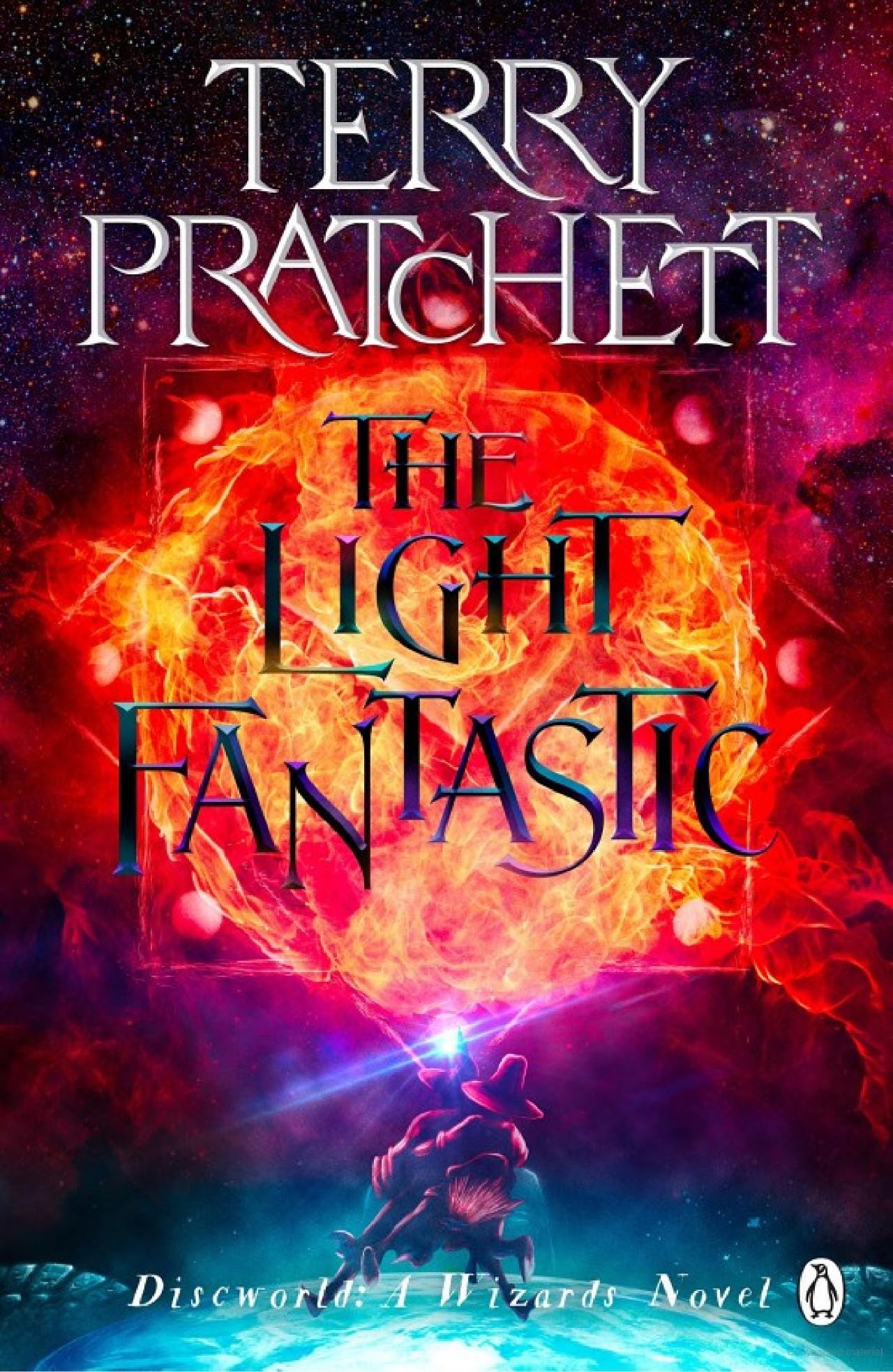
Pratchett is still in print, but I kind of hate the new covers. The trend towards cover minimalism is boring as hell. If I didn’t know who he was, I’d probably never pick up this book.
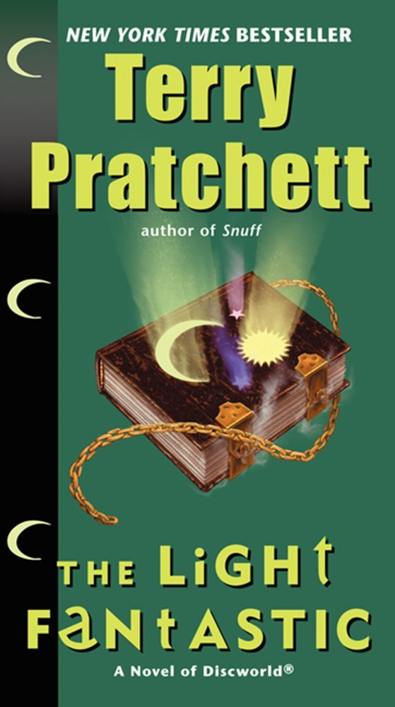
Maybe it looks vaguely interesting, but versus this absolute madness? No competition.
The old cover tells a story. It showcases Pratchett’s whimsy. Looking at that, I know it’s going to be a wild ride. I’m also dying to know more about that chest with tiny feet. Thankfully, they’re re-covering the book (which I suppose is meant to help sales recover) but I wonder if it this will give new readers the impression of ser-i-yus EPIC fantasy. If so, they might be put off by the relentless humor within.
Don’t judge a book by its cover they say. (And don’t, metaphorically. It’s generally not appropriate to judge a human or situation that way.) But quite literally, when we’re actually dealing with books, we do judge them by their covers.
If seeing a book cover is your first intro to the title or author, you’re picking it up (or clicking through) because something on the cover appealed to you. So what’s the deal?
Why have fantasy books trended towards “boring” or similar covers?
Wouldn’t you want them to stand out with crazy Old Pratchetty goodness?!
Let’s dive a little deeper here. Maybe it matters where you are on the planet. Are covers more visually detailed in some countries than others?
Yes and no.
Consider this snippet from The Guardian, released in the 20-teens, detailing covers from the UK (left) and US (right).
The UK cover visually introduces characters and gives more of the story away than the symbology on the right. We get characters and setting. But these days, that’s happening less. Covers are trending more towards homogenous symbol based international releases like the US variant on the right.
In the solemn year of 2023, cover visuals may still be changed to account for cultural and language differences, but are less likely to have distinct visual style differences.
Publishers probably see their audiences as able to access book news globally and want to avoid brand confusion. We’re watching booktokers from all over the world. And overall, symbols are rampant, at least in trad pub (traditionally published) circles.
Indie fantasy books (independently published) are trending towards populated covers, with people making uncomfortable eye contact with the reader. And boy oh boy do they love special girl with magic fire hands (see video below for more on that).
I think there’s a better explanation for why trad pub fantasy has swung towards plain symbolism.
The cover doesn’t matter (as much as their indie counterparts).
Derek Murphy of creativeindie.com has suggested that trad pub pours so much money in marketing, that the book cover matters less. Why? It’s not necessarily the first point of contact for the reader.
I worked at Chapters just out of high school. It was the height of the Harry Potter craze, and people would literally quit their jobs to wait in line for the release. Nobody cared if the book cover was smeared with dragon dung; as soon as the next book was announced, people were pre-ordering it to get it at launch. Pre-orders were starting before a cover had been released, based on a generic “image not found” picture on the store’s website.
Indies don’t usually have the luxury of that kind of marketing budget; they rely more heavily on discovery through making connections in the community and looking like similar books in their genre.
You’re less likely to have heard of them, and you’re less likely to find them in stores, so the cover is probably the first thing you see when you’re swiping on Amazon. Which brings me to number two.
Teensie-weensie thumbnails and attention spans
The second reason why we’re seeing more simplistic covers is a practical adaptation to technology. We’re reading online, increasingly on black and white e-readers (like Kindles). A complex cover in greyscale loses a lot of detail.
High concept (and high contrast) art is also more recognizable on phone sized devices. We’re statistically much more likely to be browsing on our mobile device than on its desk or lap bound counterpart. So when we’re swiping through cover thumbnails to try and figure out what to read next, we need to actually be able to understand the cover. If the title is several microns high or we have to squint to interpret the image, we probably ain’t clicking through.

The cover has to be simplistic enough to be readable across a wide spectrum of devices, show up well in black and white, and while being potentially teensy-weensy, also communicate that it fits in with hot genre trends, and therefore is similar to other books we like.
Oh, and it has to do all that in like a tenth of a second as our eyes flit over it during an absent minded scroll. Because our attention spans are shot.
Pratchett didn’t have to contend with all of that when the first handful of Discworld books were released.
Minimalism is currently trendy and sophisticated, and trad pub wants to look the part.
‘Sophisticated’ minimalist covers are more prevalent in certain genres than others. Fantasy has been trending towards high concept symbolic covers for some time. (It might be moving more towards big 3D rendered explosions of magic on the covers, but we’ll revisit that in a year or so.)
Among fiction genres, sci-fi and fantasy tend to have the highest reading challenge level (at grade 8-9), followed by historical fiction, which also seems to have big feelings for symbol covers.
Perhaps minimalist symbol covers play to a supposed sense of academic superiority. Who doesn’t like to think of themselves as elite? Publishers want to differentiate their carefully curated works of marketing from the indie riff-raff. They Marie Kondo-ed their covers and chucked out the excess.
Trad publishers may be gambling that a ‘more literate’ readerbase is more educated, and thus elite, and therefore more visually intrigued by futuristic design trends, such as minimalism.
And yes, fantasy lovers do tend to eat up minimalism by seeking the simple life of the past - but that’s a topic for another time.
Design wise, when is the last time you saw really medieval art on a hit fantasy novel? Marginalia just isn’t in fashion.
People are reading to escape and slow down
As our digital lives become increasingly complex, people are reading to get off the information treadmill.
A cover that’s more straightforward offers visual rest.
A cover that’s ridonculously similar, or at least thematically similar to other books in the genre eases decision fatigue. The brain goes, “I liked these books and this one looks similar.”
People who have favourite authors identify with covers that remind them of their favourite authors. And that’s the way it is.
Indie book covers tend to differ from their traditionally published counterparts. Many people buy them because they’re indie books. The cover style distinction has become a point of pride for many in the indie community.
We get emotionally attached to characters and stories. And people tend to want to stick with what they know and care about. And so,
Maybe readers do want 11 books of a woman lying on a gravel road
Trends change. Books get re-covered. Sometimes, authors miss the mark and have to try again.
And sometimes, people really do want 11 books of a magic woman holding fire in her hand.


